


As electric vehicles (EVs) become more mainstream, residential buildings are evolving to support the growing demand for EV charging. However, managing charging infrastructure in housing complexes presents several challenges—especially around energy monitoring, user control, and cost management. The KotiCharge electricity dashboard is built to solve this problem.
With real-time data, smart charging insights, and easy-to-understand analytics, the KotiCharge electricity dashboard equips housing managers to operate and oversee EV charging systems with confidence and efficiency.
What is the KotiCharge Electricity Dashboard?
The KotiCharge electricity dashboard is a comprehensive digital platform designed to simplify the management of EV charging infrastructure in residential housing. It centralizes data related to charger usage, energy consumption, session statistics, and cost breakdowns into one user-friendly interface.
Whether you’re managing a single apartment complex or a network of properties, the KotiCharge electricity dashboard allows you to track performance, identify trends, and make informed decisions to optimize energy use and reduce operating costs.
Role of the KotiCharge Electricity Dashboard
The primary role of the KotiCharge electricity dashboard is to make energy management transparent, efficient, and actionable. Here’s how:
Track EV charger usage in real-time
Monitor electricity consumption (kWh) and cost
Compare Smart Charging vs Manual Charging performance
Identify peak and off-peak usage times
Break down costs for better budget planning
Support energy-efficient behavior among residents
In short, the KotiCharge electricity dashboard helps housing managers move from reactive oversight to proactive energy leadership.
Inside the KotiCharge Electricity Dashboard
The dashboard is structured to provide both an overview and deep-dive capabilities, making it easy for users to toggle between high-level stats and detailed reports.
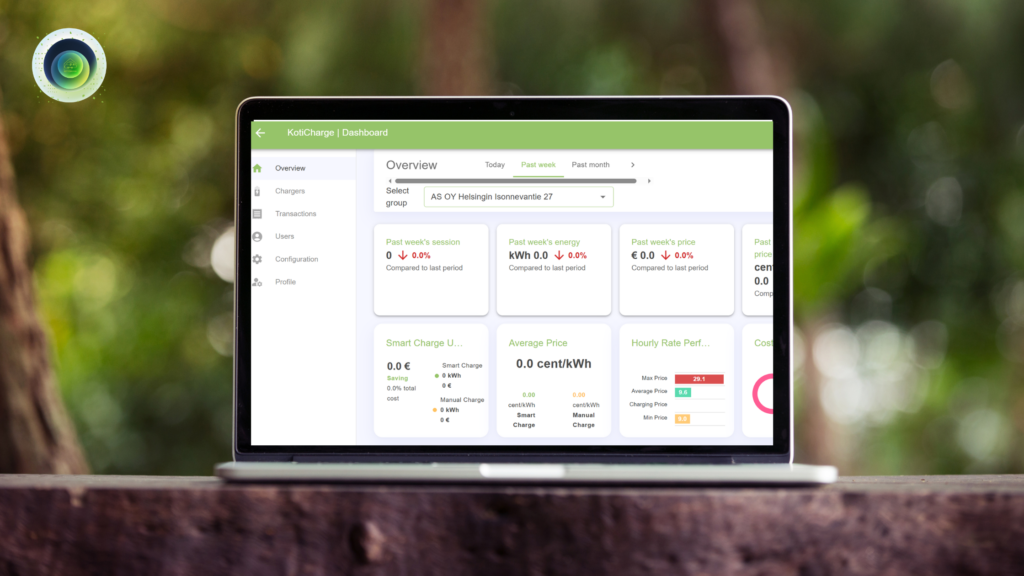
Dashboard Layout Structure
The left side of the dashboard contains a menu with categories including Overview, Chargers, Transactions, Users, Configuration, and Profile. Managers can select any of these to access the respective data and tools.
The right-hand section is the main workspace where data is displayed based on the selected category and time period. This is where real-time insights and historical data come to life in the form of tables, graphs, and summary blocks.
The 8 Key Blocks in the Overview Section
After selecting a housing group and time period, managers are presented with eight data blocks that summarize EV charging performance. These blocks provide essential operational insights for decision-making and planning.
Charging Sessions
This block shows the total number of EV charging sessions within the selected period. Housing managers can use this to track the demand for EV charging across the building. An increasing number of sessions may indicate growing adoption of electric vehicles, signaling a need for infrastructure expansion.
Energy Consumption (kWh)
Displays the total energy consumed by all chargers during the selected time frame. This metric is essential for understanding the electrical load and ensuring the infrastructure can handle the demand. It can also support planning for future energy needs.
Total Energy Cost (€)
Shows the total cost of electricity used for charging. This allows managers to monitor operational expenses and helps with budgeting and forecasting. It’s also valuable for reviewing cost-effectiveness across different time periods.
Average Energy Price per kWh (€)
Provides the average cost per kilowatt-hour during the selected timeframe. By comparing this rate with market prices or other providers, housing managers can make informed decisions about switching energy providers or adjusting usage strategies.
Smart Charge Usage
This block highlights how often Smart Charging was used versus Manual Charging, along with the total cost savings. Smart Charging automatically schedules EV charging during cheaper electricity hours. If Smart Charging usage is low, managers can use this insight to encourage residents to switch to it, potentially reducing electricity costs for everyone.
Average Price Comparison (Smart vs Manual)
Offers a side-by-side look at the average cost per kWh between Smart Charging and Manual Charging. This visual comparison helps demonstrate the benefits of Smart Charging and can guide users toward more economical habits.
Hourly Rate Performance
Displays the highest and lowest energy prices during the day. Understanding when energy is most expensive helps managers shift charging and other heavy energy activities to off-peak hours, optimizing building-wide consumption and reducing bills.
Cost Breakdown
Breaks down the total cost into transmission, electricity, and usage fees. This provides a transparent view of where the money goes, helping managers explain costs to residents and evaluate opportunities for cost reduction in specific areas.
These eight blocks transform raw data into practical insights. Managers can evaluate current infrastructure efficiency, identify peak consumption patterns, detect areas for cost savings, and even promote smarter usage behavior across the housing community.
Chargers Section: Group Overview
The Chargers section offers a summary view of all chargers installed in a particular housing group. For example, in the case of “AS OY Helsingin Isonnevantie 27”, the dashboard shows:
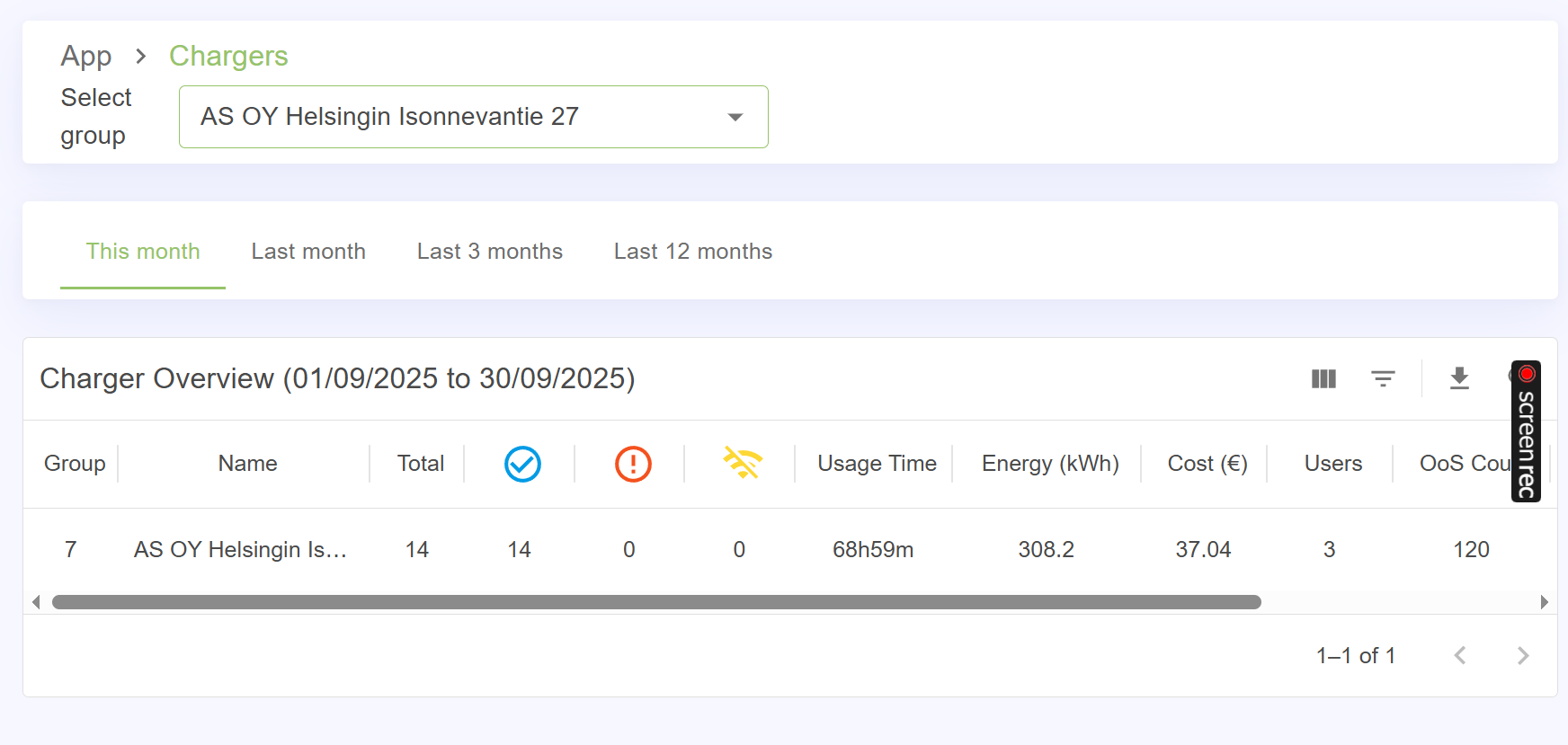
- Total chargers: 14
- Active chargers: 14
- Offline chargers: 0
- Usage time: 68 hours and 59 minutes
- Total energy consumed: 308.2 kWh
- Total cost: €37.04
- Users: 3
- Out-of-service incidents: 120
This overview allows managers to assess whether chargers are being used effectively, and if maintenance is needed. It can also reveal usage imbalance, where some chargers are heavily used while others remain idle.
Detailed Charger Status
Each charger is listed with its own status details, including:
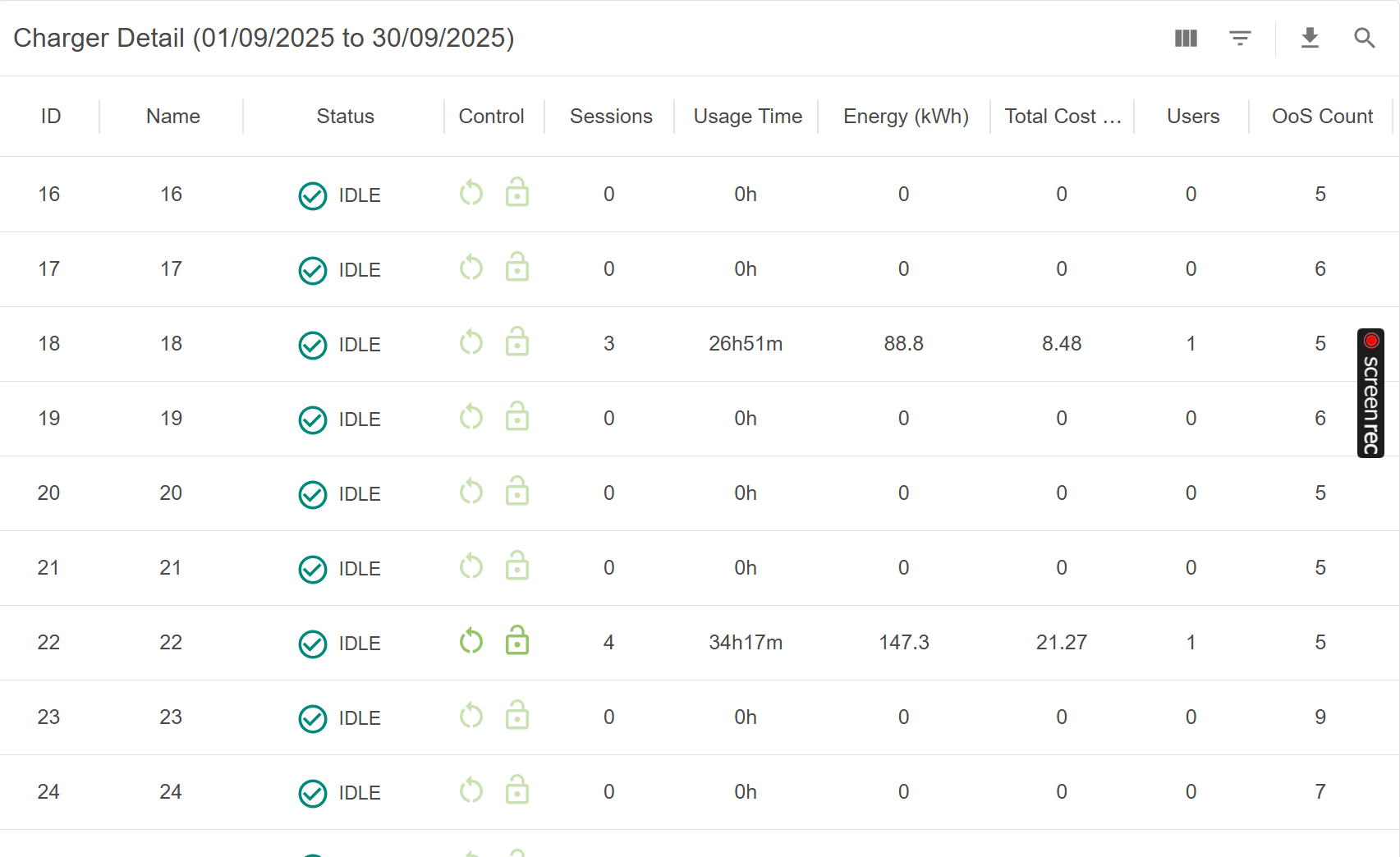
- Number of sessions
- Usage time
- Energy consumed
- Individual cost
- Number of users
- Out-of-service count
This level of detail helps housing managers identify which chargers are used most frequently, which may require more maintenance, and which could be relocated or optimized for better performance. For example, if only a few chargers are in use while others sit idle, it might be time to promote usage or check if those chargers are functioning properly.
Consumption Chart
The KotiCharge electricity dashboard also provides a visual graph showing daily consumption patterns. While in some cases (as seen in the screenshots) data may not yet appear for certain days, this chart usually offers powerful insights into:
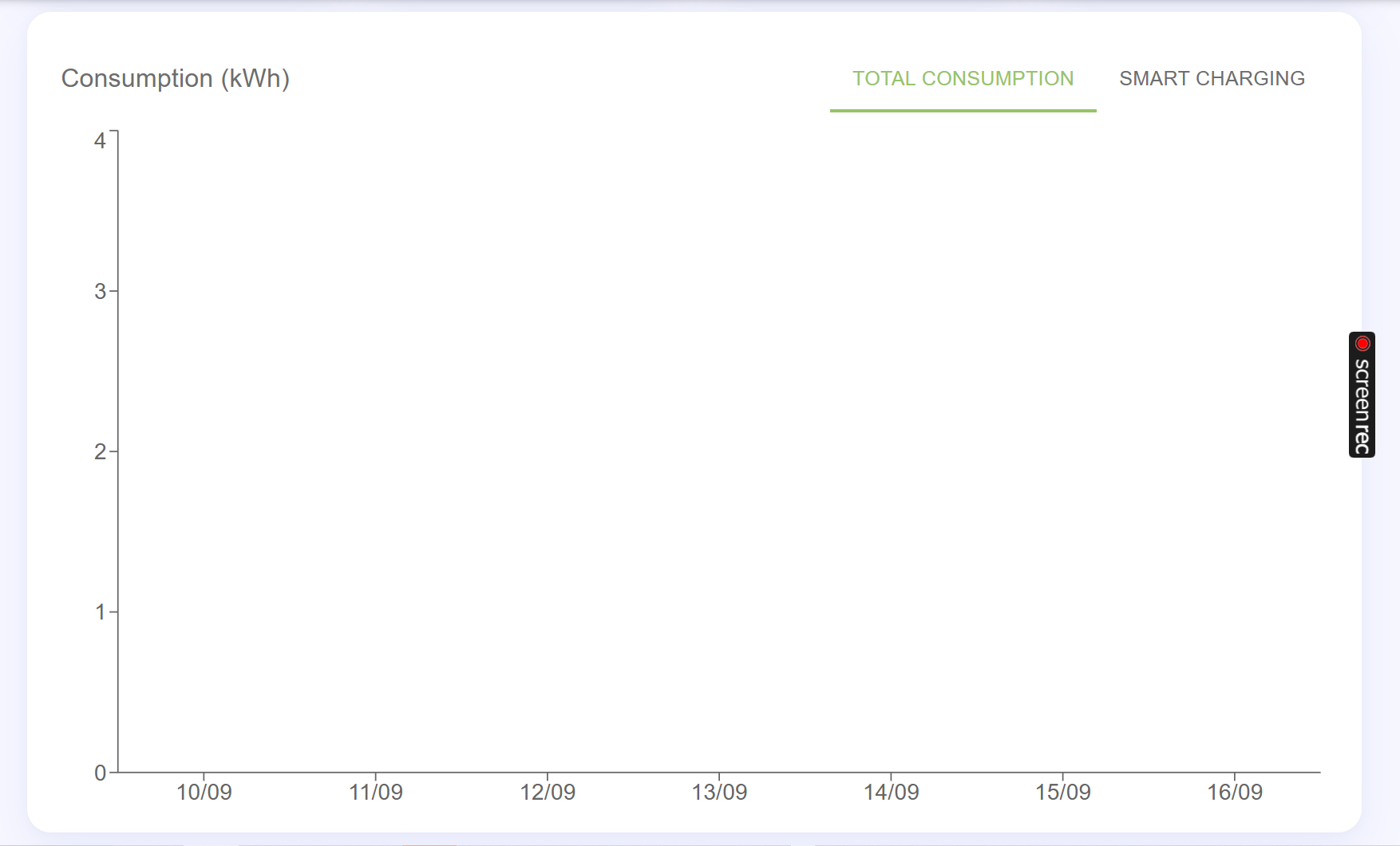
- Daily or hourly electricity usage
- Smart vs Manual charging trends
- Energy spikes or anomalies
- Peak usage times
This graph is especially useful for identifying trends over time, which helps managers plan energy budgets and optimize when EV charging should take place.
Why Choose the KotiCharge Electricity Dashboard?
The KotiCharge electricity dashboard brings simplicity and clarity to EV energy management. It empowers housing managers by providing real-time data, user-friendly controls, and detailed insights that lead to better decisions.
With this tool, housing managers can:
- Prevent charger overloads
- Plan infrastructure upgrades
- Encourage Smart Charging
- Reduce energy costs
- Provide accurate billing
- Increase resident satisfaction
- Promote sustainable practices
This platform turns data into action. With the KotiCharge electricity dashboard, managing EV infrastructure no longer requires guesswork—just smart planning and efficient oversight.
Interactive Location Mapping
One standout feature of the KotiCharge electricity dashboard is the integrated interactive map, which visually displays the exact locations of installed chargers across different properties.
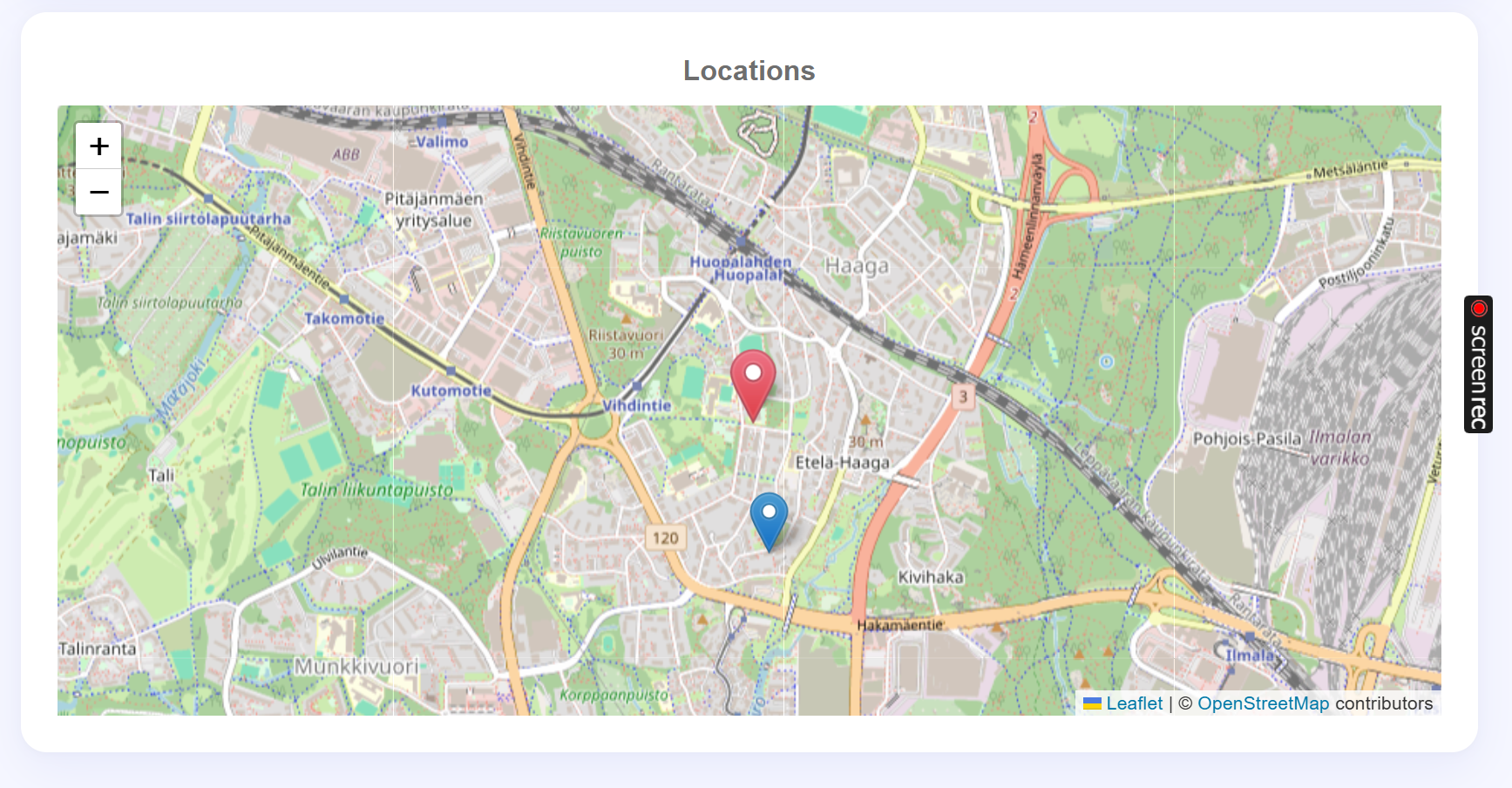
With this map, housing managers can:
-
Instantly identify where each charger is placed
-
Differentiate between multiple properties and charger clusters
-
Verify installation locations without needing to visit each site
-
Coordinate maintenance or upgrades based on physical location
This feature significantly improves operational awareness and streamlines logistics, especially for managers responsible for multiple housing areas. By using visual pins on the map, managers can manage geographically spread-out assets from one centralized dashboard.
Final Thoughts
The transition to electric mobility is here, and housing managers must be ready to support this change. The KotiCharge electricity dashboard provides the essential tools to monitor, analyze, and improve EV charging operations across residential buildings.
From real-time charger data to smart charging insights and cost-saving tools, it offers a complete view of your energy ecosystem. With the KotiCharge electricity dashboard, housing managers can confidently lead the shift toward cleaner, more efficient living.
More Articles
How KotiCharge Helps Users to Split Tehomaksu Cost Fairly and Avoid Tehomaksu Cost
Miten KotiCharge-hallintapaneeli auttaa havaitsemaan latauslaitteen varhaiset viat
KotiCharge Supports Harju Elekter Charger